Creative Resume Designs That Stand Out in 2026
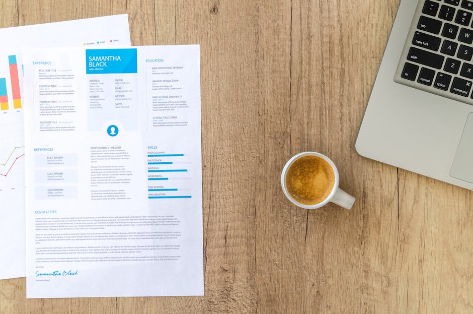
Photo by Lukas Blazek on Pexels
Standing Out Without Breaking the Rules
The job market in 2026 is more competitive than ever, and a well-designed resume can give you a genuine advantage — when done right. The key challenge is balancing visual distinctiveness with professional credibility. A creative resume that sacrifices readability for style will hurt your chances far more than a plain but well-organized one.
This guide covers the creative resume design trends that are actually working in 2026, along with practical principles for making your resume memorable without undermining its core function.
2026 Design Trends for Resumes
Thoughtful Color Accents
The best creative resumes in 2026 use color with intention, not excess. A single accent color applied to section headers and your name creates a polished, modern look. Muted tones — deep navy, forest green, burgundy, charcoal — have replaced bright neons. The accent color should occupy no more than 10% of the page’s visual area.
How to apply it: Choose one color from your personal brand or the company’s palette. Use it for your name, section headings, and perhaps a thin left border. Everything else stays black or dark gray on white.
Typographic Hierarchy
The trend in 2026 is toward bolder, more intentional typography rather than decorative graphics. A well-chosen typeface combination creates visual interest through contrast in weight and size.
How to apply it: Use a bold sans-serif like Inter or Montserrat for headings. Pair it with a neutral body font like Source Sans Pro or Calibri. Keep body text at 10-11pt and headings at 14-16pt.
Generous White Space
Modern resume design treats white space as a deliberate design element. Generous margins, comfortable line spacing, and breathing room around section headings make the document feel more premium.
How to apply it: Set margins to at least 0.75 inches on all sides. Add 6-8 points of space between bullet points and 12-15 points between sections.
Minimal Iconography
Simple line icons for contact information remain popular, but the trend has shifted toward smaller, lighter-weight icons that sit inline with text rather than large decorative ones.
Subtle Layout Asymmetry
Slight asymmetry — such as a thin colored bar on the left edge or offset section headers — adds visual interest without compromising the single-column structure that ATS systems need.
Creative Resume Styles by Industry
Tech and Startups
Tech companies appreciate modern design but also value clarity. A clean resume with a subtle color accent, good typography, and perhaps a dark mode option performs well. Avoid excessive creativity — tech recruiters scan quickly and want to find your skills without effort.
Marketing and Advertising
Marketing resumes can be more visually expressive. Consider using a two-color palette, a bolder heading font, and strategically placed visual elements. The design itself becomes proof of your marketing sensibility.
Creative and Design Roles
For designers, the resume is a portfolio sample. Use a layout that showcases your design eye — careful attention to grid systems, type pairing, color theory, and spacing. Keep the content hierarchy intuitive.
What to Avoid in 2026
- Progress bars for skills. They communicate nothing meaningful and waste valuable space.
- Headshots and photos. Inadvisable in most English-speaking countries due to bias concerns.
- Infographics and data visualization. Difficult for ATS to parse and often appear gimmicky.
- Multiple colors without purpose. Limit yourself to one accent color plus black and white.
- Decorative elements that crowd content. If it reduces font size or tightens spacing, it is not worth it.
Practical Steps to Create Your Creative Resume
- Start with a clean, ATS-compatible template from resumefree.online as your foundation.
- Choose one accent color that aligns with your personal brand or target industry.
- Select a typeface pairing: one bold sans-serif for headings, one clean sans-serif for body text.
- Adjust margins and spacing to create generous white space around all content blocks.
- Add a subtle visual accent — a left-side color bar, offset headings, or minimal section dividers.
- Write your content and then remove 20% of it. Every word must earn its place.
- Test your resume by asking three people to find your most important qualification within 10 seconds.
Final Thoughts for 2026 Job Seekers
A creative resume in 2026 is not about being flashy — it is about being intentional. Every design choice should serve a purpose: making your qualifications easier to find, remember, and act on. Browse the creative resume templates at resumefree.online to find a starting point that matches your industry and personal style.